A few highlights!
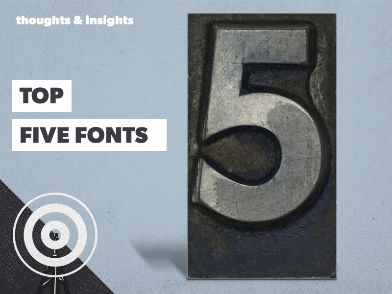
It isn’t about which one you pick, it’s all about how you use it. Choosing the right font is often one of the most important parts of the design process.
It isn’t about which one you pick, it’s all about how you use it. Choosing the right font is often one of the most important parts of the design process. Hitting that sweet spot between a distinguishable style, while still maintaining clarity and readability. While the copy communicates the purpose and meaning, the font is the final piece of the jigsaw for a refined design. We asked some of our designers about their top fonts and we think they’re pretty reflective of their individual personalities…
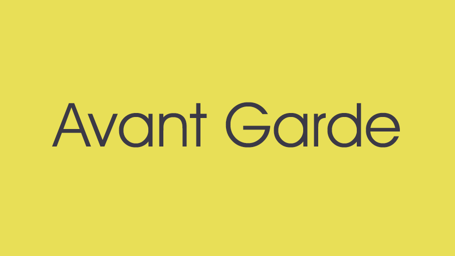
AVANT GARDE
As Head of Artwork, we went straight to Matt to see what his top choice typeface is – he said it’s Avant Garde. When prompted to give a reason he simply said, “it creates the most perfect circular Os” – that’s definitely the perfectionist in Matt coming out. Not only is it used in the Royal Air Force logo, but keen eyes will also spot it in Stranger Things title sequence.
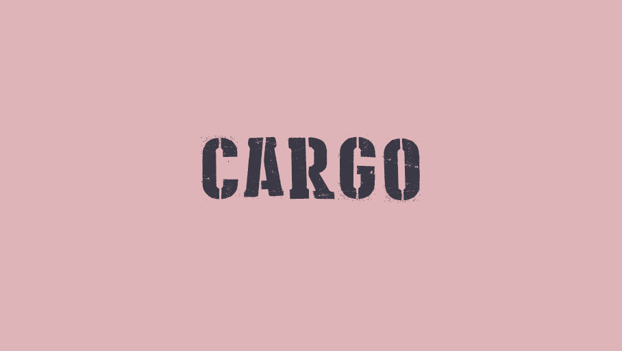
CARGO
This headline typeface was picked by our headline office act, Mike. Characterised by curved stencil cuts, this font brings a proper retro vibe – just like Mike – he’s about as retro as it comes. Despite its rustic feel, it was actually only introduced in 2003 and has appealed to designers for its ability to create an iconic design piece.
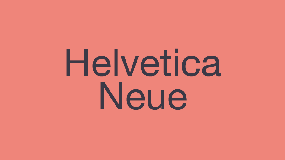
HELVETICA NEUE
One of the oldest and all-time classics, our packaging guru, Jon, was first to claim it as his favourite. It was created in 1957, yet it never tires and remains one of the most popular typefaces on the planet. Jon loves the capacity to manipulate this typeface to form bold and strong logos, as well as more simple typography.
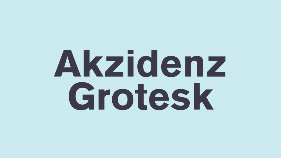
AKZIDENZ GROTESK
Andy O’s current top font is Akzidenz Grotesk. It’s timeless, bold and minimalistic, providing a modern and elegant look in whichever weight you use. He added that he’ll always prefer it over Helvetica (which was actually inspired by Akzidenz Grotesk) – we’ll let Jon and Andy O have it out on that one.
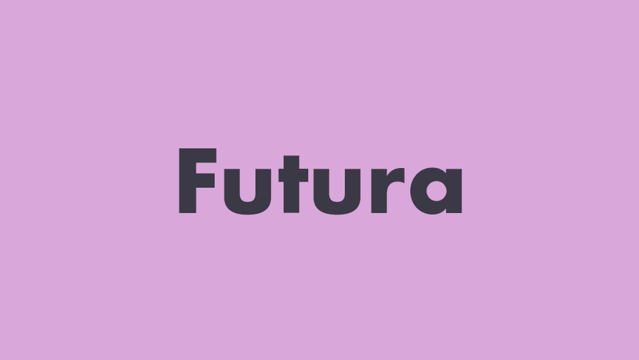
FUTURA
Charlotte said she’s backing Futura all day long because it’s the one font you see absolutely everywhere without realising. Even though a lot of designers consider it “an obvious lazy go-to-choice” she knows it just works. It’s featured on the moon (on the plaque left by Apollo 11 astronauts), Nike trainers, Domino’s Pizza boxes, Absolut Vodka bottles and Red Bull cans – if that’s not versatility, we don’t know what is!
We love playing around with fonts here at STM. Just to leave you with one final thought from us – when it comes to font, size really does matter!


When you visit us in Manchester
We have free parking available on site (M4 6AX) but, spaces are limited. Day parking is also available on Goulden Street just round the corner.
When you visit us in Leeds
If you’re visiting us in Leeds we’re based at Mabgate Mills (LS9 7DZ) and there are plenty of parking options nearby.
Day parking is available nearby with free on street parking available for 4 hours on Cherry Row and reasonably priced parking on Macaulay Street and Mabgate via an app called ‘Park Mobile’.